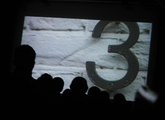
Before you laugh about the fact that I attended the
Gene Siskel Film Center screening of
Helvetica [1] last night – a documentary about a typeface – you should know that the event was sold out. As were both screenings the night before.
Of course, the room seated about a fraction of a regular movie house. But still.
I’d call myself a type wonk; my husband calls me (and did, just last night) a type whore.
Maybe because I spent a little too long pouring over cases of old type at last weekend’s Printers Row Book Fair (“you go ahead, sweetie – I’ll catch up”); maybe because I read
Jan Tschihold for kicks and have a hunch that the 1949 Playbill for
Kiss Me Kate that I inherited from my grandfather was strongly influenced –
if not designed by -- a young Paul Rand (my money’s on the latter), who was kicking around New York at that time . (Just as my money’s on the hunch that Al Hirschfield drew the cover of the 1950 Playbill for
Kizmet that hangs alongside it, carefully framed on the wall, even though when I pinged the good folks at
Playbill to confirm either they said “our records don’t go back that far”).
But in truth I’m a pimp and procurer; more John than whore. I use type, devour it, expect it to please me and am willing to pay for the privilege.
I’ll spare you my reaction to seeing Zapf himself on screen; save you the discussions of weight and line and heft and containment;
ascenders,
descenders,
x-heights and
baselines; and give you just this: the movie is about more than Helvetica. And it doesn’t take sides (well, nearly not). So if you’re not a fan of the ubiquitous Swiss face, you can still have a good time.
The conflict that the movie chases down is whether or not, in design, we expect to speak
through our letterforms – expect them to remain “invisible”, “like the air”, as Helvetica was described several times in this film -- or whether we want our letterforms to speak
for us -- to assist the word, to shape the emotional impact that it will have on us. Do we want “explosion” to explode; the word “caffeinated” to be wired, jittery, amped up, alive? Or do we want a clarity of form that’s nearly translucent, one that allows letterforms to emerge without hindrance to become what they’re meant to be – words.
To my mind, type, for those who know they care [2], is a matter of taste, like lingerie – some prefer to cloak the form through which they realize their desires in lace, bows and ties; others prefer the barest concealment, so that the curve of the word can come through true.
Hiding somewhere in the back and forth bickering among the rock stars of typography and design who populate the movie were some interesting questions about modernism, post-modernism, and the way each generation reinvents itself, smashes the constructs that the last generation worked so diligently to create anew so that something of theirs will last them out -- but of course it doesn't. Not all of it, anyway. Because of course the next round of dreamers and believers will smash it down and begin again.
And maybe at the end of the day they come up with something that, fundamentally, is very much like the thing that circulated not too long before – maybe two, three, generations ago. Maybe. Or maybe not.
But it’s new, and it’s theirs.
And then we begin again.
p.s. There was a joke in the film about type wonks who have a hard time with period films that get the typefaces wrong – for those with an interest in these things, Mark Simonson fires off about that very thing in his classic piece,
Typecasting »[1] And you thought I was
kidding.
[2] And anyone who
reads is impacted by type, whether they realize it or not.