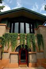
It caught me by surprise -- but I suspect Frank Lloyd Wright knew exactly what he was doing when he designed it. He forces anyone who wishes to enter the sanctuary to first descend into a cloistered walkway (which runs in a tight, squared embrace, around the whole of the worship space – you could lap it in 2 or 3 minutes, easy) and then forces them again to ascend – single file -- into the sanctuary.
It’s that ascent up the steep narrow walkway, into a gorgeous angular space that is three stories high and shockingly intimate; that brought tears to my eyes.
Any FLW fan will tell you how he did it: with compression and release.
Wright was the master of lowering the lid – bringing the space in snug and tight around his occupants -- and then lifting it again into a soaring space that is both theatrical and habitable – to create a frame around domestic life.
I had a chance to see the Dana-Thomas house over the weekend and was reminded of Wright’s flair for the dramatic all over again. Built on 16 different levels, the house frames out multiple stages, platforms, barrel ceilings and performance spaces – all which live organically with myriad intimate nooks and conversation spaces. The massive home was built to be theatrical from day one: Sarah Lawrence Dana-Thomas, daughter of one of the richest men in Springfield (a mason and friend of Lincoln with government contracts) commissioned it after the death of her second husband (there would be one more before she was done) to entertain. She also opened her checkbook wide to Wright.
What more could a drama queen like FLW want?
Not much, it would seem. I have no shots of the interior to share – interior shots aren’t allowed, and the gift shop, for some unknown reason (but almost certainly because someone else owns the copyright) doesn’t sell a color catalog of the house (only one in black and white) – so please pardon my sputtering as I try to explain what happens there.
Through a beautiful accident of history when an attempt was made to auction the contents of the home in 1941 – all of which Wright designed and assigned to their appointed place – no one wanted them. As a result 90% of the furnishings and finishes remain intact. And – in one of those stories that docents love to tell – the State of Illinois (which owns the house now, having bought it back from a publishing company that had used it as offices for many years) re-acquired one lovely Wright designed stained-glass lamp that had gone missing at auction not too many years ago – for $750,000.
When it was built almost 100 years ago the entire house, with all of its furnishings, cost about $60,000. (To be fair: that’s equal to $4.5 million today.) (Interesting to compare what a dollar will buy you -- Mies’ Farnsworth House cost about the same sum, and was built about half a century later.)
The upshot is that the visitor has a chance to experience Wright at his most organic – surrounded not only by the striking modernity of his framed walls – but by the intimacy and elegance and harmony of his furnishings. The long, lean lines of oak; the jewel box details of art glass; and always the progression from stage to stage – up steps to the next level, tight little stairways and passageways which open into great big gorgeous barrel vaulted ceilings.
One of my favorite details was in the lower level – below ground, but it would be too pedestrian to call it a basement – Wright constructed a duck-pin bowling lane, framed by warm stucco walls under an arched ceiling. We encountered it on the tail-end of the tour – I thought for certain, after all our walking, that it was tucked into the back corner of the house – but it turned out to be tucked away right under the front door.
The Dana-Thomas House is unlike anything I’ve experienced before in a building. When folks talk about Wright’s desire to control the contents of the home – down to the dress of the woman of the house – the story is cited (generally with laughter) as an example of his overweening desire to control his clients.
But the space that he created with the Dana-Thomas house is not controlling – it doesn’t force conformity – it creates a stage for people to do what people do. To come together – in conversation and shared meals and experiences – in close, intimate compressions – that evolve into larger, theatrical expressions – whether in the performance spaces (Carl Sandburg read there; John Philip Sousa played there) or in the bedrooms (unfortunately the docent provided no details – but isn’t that where the best human dramas wind up?). And isn't it through human intercourse (conversational and otherwise) that we undergo transformation?
The Dana-Thomas House is a sociologist’s dream.
I have a little bit more to say but I’ll save it for later. In the meanwhile, here’s a slideshow of the home’s exterior »
Regrets that I can’t show you the real workings of the interior – you’re gonna have to roadtrip to Springfield to see it for yourself.
Frank Lloyd Wright's Dana-Thomas House
301 East Lawrence Avenue
Springfield, Illinois 62703


3 comments:
loved this - and the slideshow too :)
I'm sold. So well written too!
Beautiful photos. Thorougly enjoyed the cropping/framing decisions. Too bad about the ban on interior photos.
Post a Comment