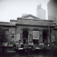
I love the New York Public Library in Midtown Manhattan. I love the little hotel that I usually stay at because it's right there, near the library. I love that our NY office is just a block or two away. I love the Rose Reading Room, where I can camp out and get some work done in all that light and space and on those lovely long tables lit by those beautiful copper lamps.
A long long time ago I designed the information architecture for the Seattle Public Library's web site where I proposed a component of their site design that they still use today -- a library locator that, when selected, takes the visitor to a page that's dedicated to their local branch. I know: seems like a no brainer today. ;) But this was before MapQuest even (I'm pretty sure) and the Seattle Public Library was working hard to get the public behind funding of a new downtown library building, and they kept hearing complaints from folks who said "MY library is my LOCAL branch." So we wanted to make that idea clear and inclusive in the information architecture of the site. Which we did. [1]
I learned a few months after it went live from my SPL client that she met with the folks from NYPL and they commented that they really liked that locator feature. So guess what they did? Yep: got one of their own.
So yeah: there is a little piece of me that is over the moon happy to think that the NYPL has a little piece of me on their website. Because that part that's stored deep in my heart? The one that loves climbing those double branching stairways and double dog digs the marble washrooms: it's the deep heart parts that are often the hardest to see.
[1] And a footnote: The original execution -- which is not longer out there -- had all of the branches displayed as links on screen in the right hand rail. It's now a dropdown menu which I don't dig as much. It doesn't tell the story in the same way: It doesn't have the same heft that says "We are Us."


No comments:
Post a Comment